Bldg 28 Church
A fresh brand for a growing church in the Tampa Bay area suburbs
When Bldg 28 Church and I first worked together over a decade ago, they were just coming together as a small church plant of around 30 people. The logo was already in place, and I tried to work with and around what was already there.
After over a decade, the church had grown from 30 people to close to 1,000 and it was time to revisit the outdated brand image and everything attached to it. A brand refresh and a more modern logo, aesthetic and website were just what was needed.
Primary Logo Mark

Before
After
01
02
03
04
The Challenge
Not only was the current logo outdated, the entire aesthetic was aging quickly: from the interior of the building, the signage, website, and everything else associated with the church. The need was for me to step in and revamp everything from the ground up. That included a fresh take on the interior design and decor, the signage and print media, the website and more.
“Nathan’s creativity, work ethic, communication and knowledge are all top shelf. Our church has benefited in countless ways from he and his team. I highly recommend him!”
Jeff Singer
Director of Media & Operations
What We Did
-
Brand Identity
-
Research & Strategy
-
Web Design & Development
-
Search Engine Optimization
-
Graphic Design
-
Copywriting
-
Print & Packaging
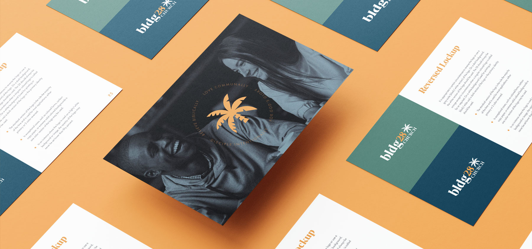
Logo Mark Presentation

Branding
It can be tempting to completely throw out an existing image and aesthetic when refreshing a brand, especially if the logo feels super outdated and antiquated. But keeping the core orange color, the palm tree, and the unique feel of Bldg 28 Church was paramount. The church had grown so much over the past decade that it was recognizable in the community and had established itself in countless ways. I had to take what they had and work to keep the identity and soul of it while completely refreshing the logo and modernizing the identity.
Ministry Logos

The Answer
Church life at Bldg 28 revolves around the palm tree icon - a memorable staple image in the Clearwater / Tampa Bay Area. My objective was to take the palm tree and completely put a modern and contemporary spin on it. From there, I would work in a clean and elegant type face to give it that more modern approach.
Following on the logo refresh / rebrand, was the need for every other component that the church needed. Essentially, it was starting from the ground up with the new identity: website, graphic design, signage, apparel, and more.
Website Presence
Website Design
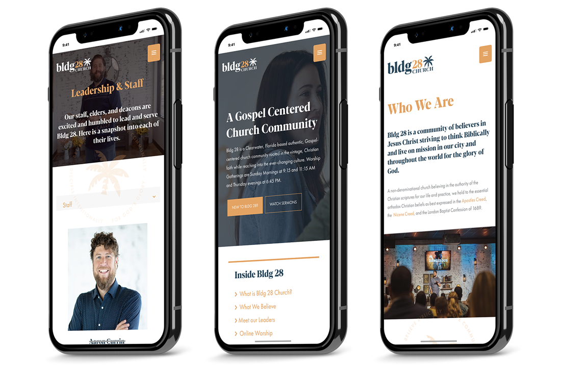
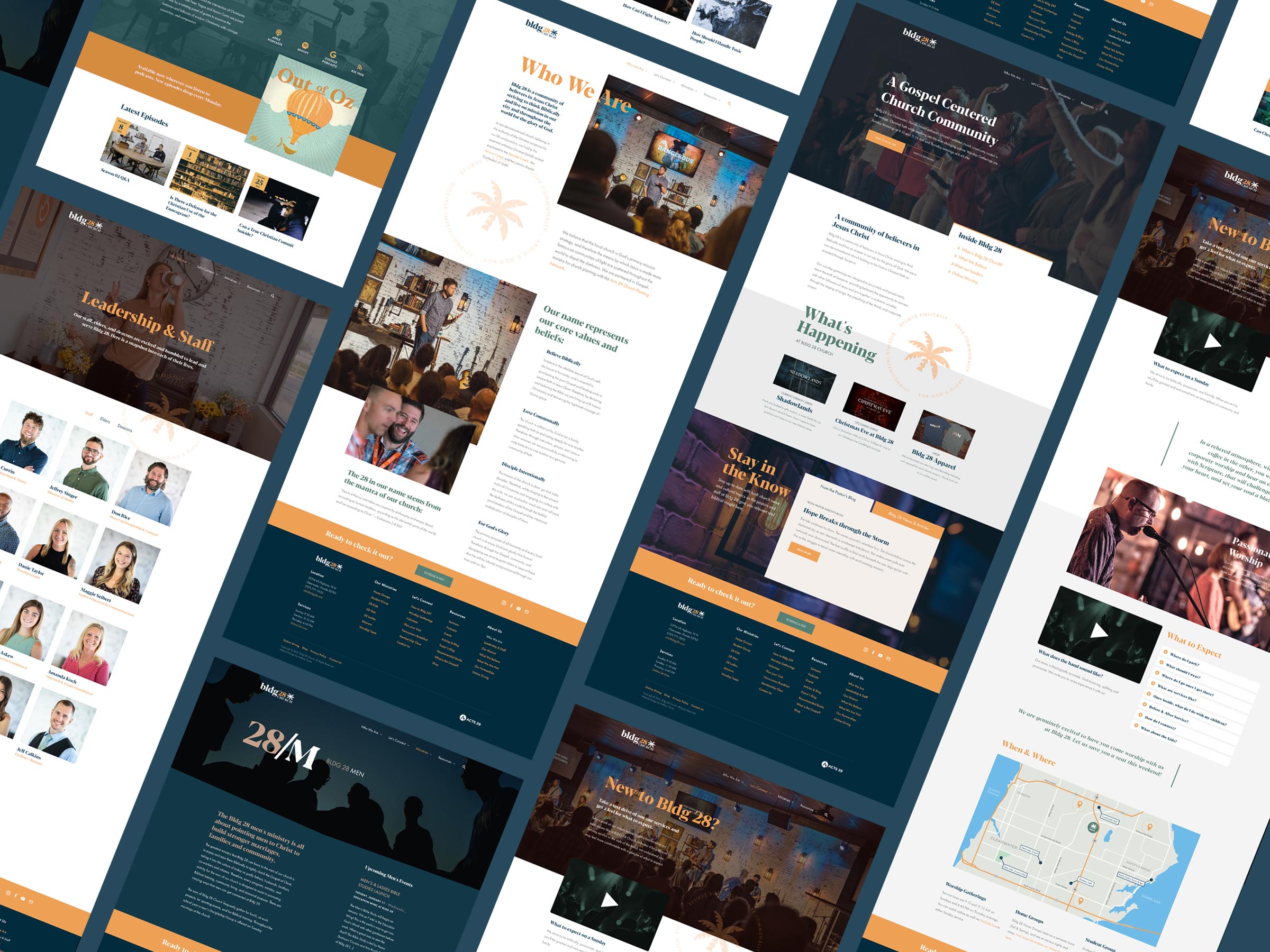
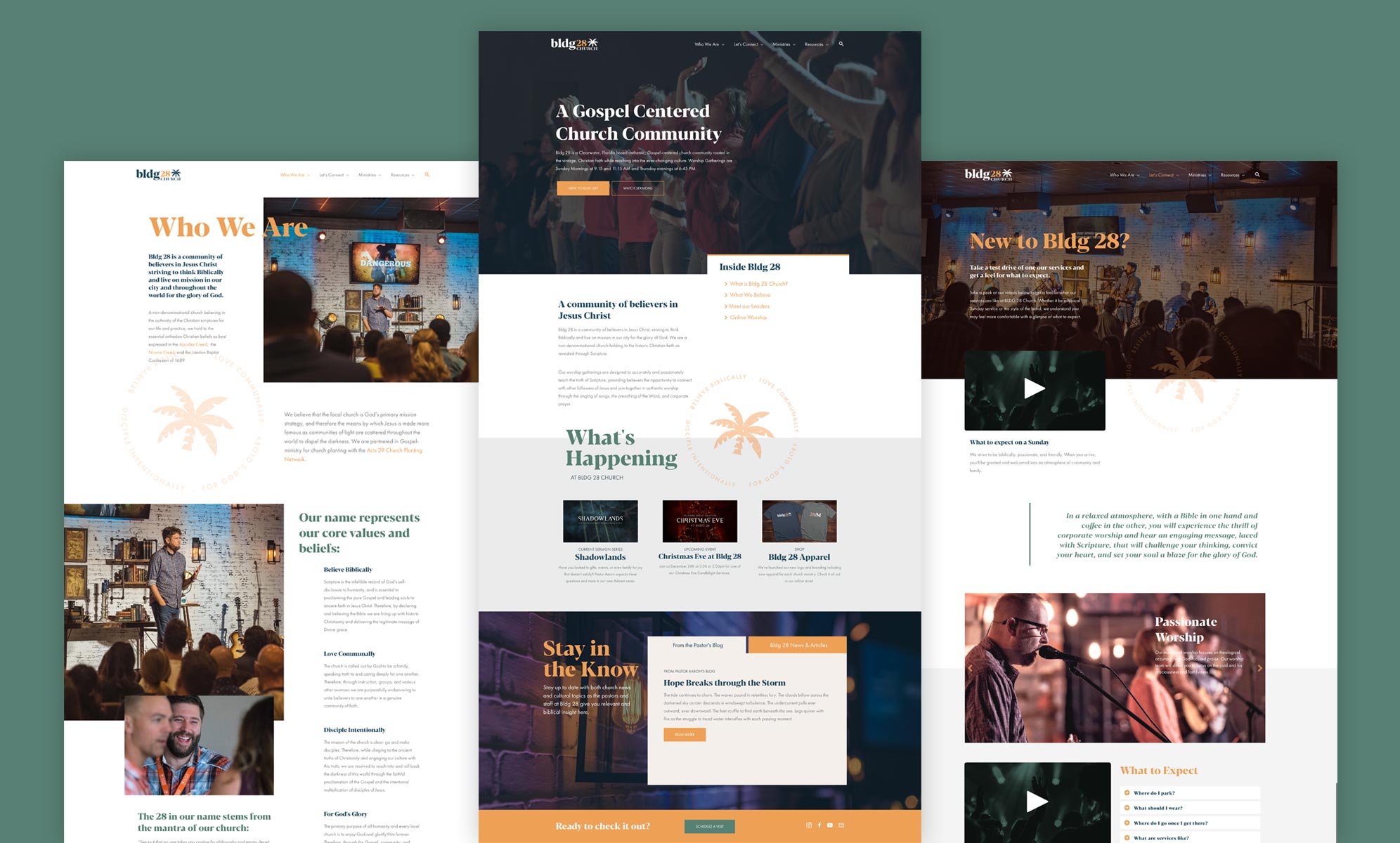
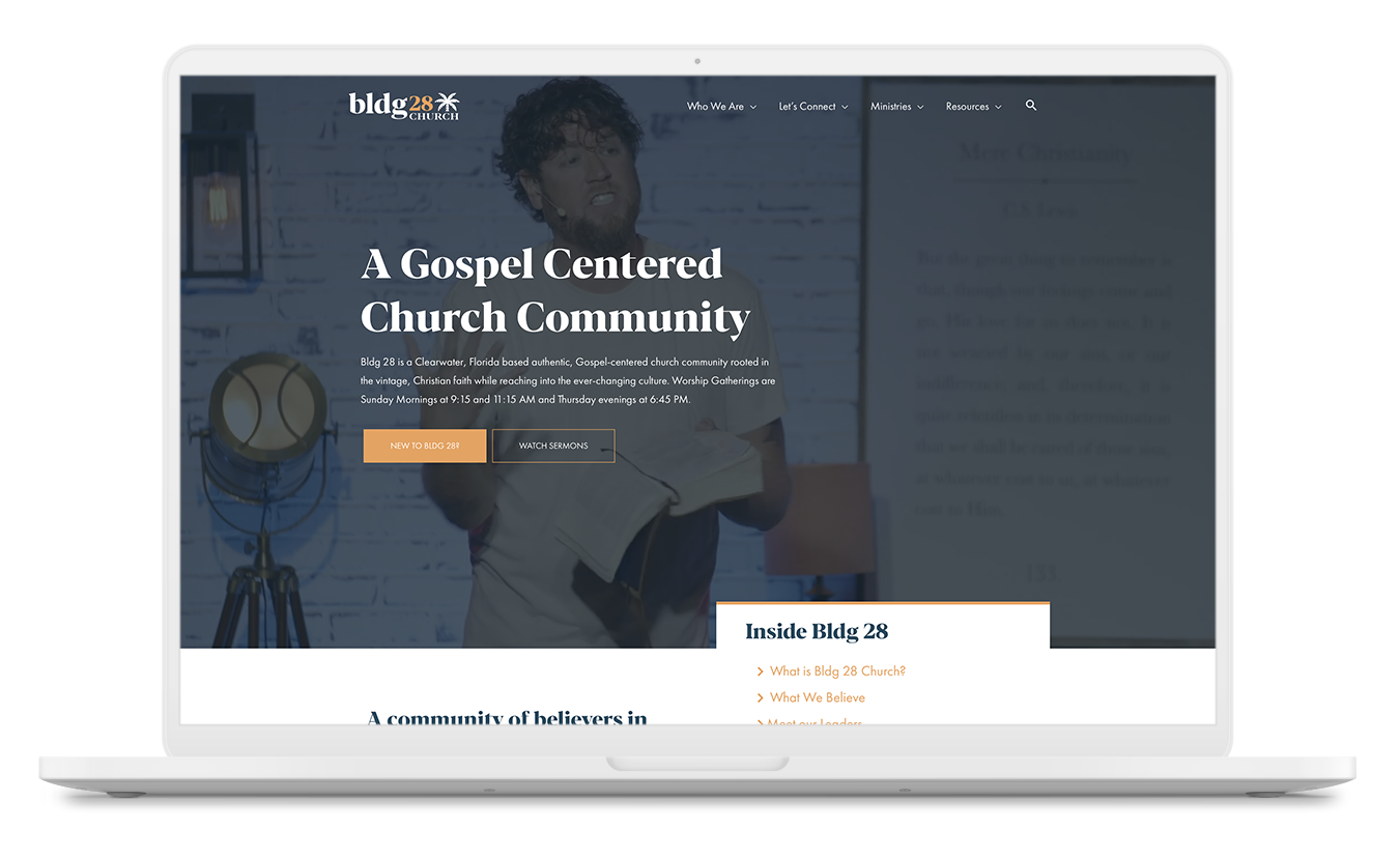
The goal for the Website redesign, was taking an existing site that already worked in some capacity and expand upon it in terms of usability, functionality, design, and content. Bldg 28 Church employed our services for copywriting as well as Search Engine Optimization to continue to help the website rank well in Google.
The new website has expanded features and content: providing extensive ways for visitors and attendees to sign up for services, volunteer, and join a Home Group. Events are now more prominent, information is clearer, and there is a distinct difference in the aesthetic to make the flow of the site easier for users and match the personality of the new brand identity.
Interior Signage & Design
Aesthetic Design
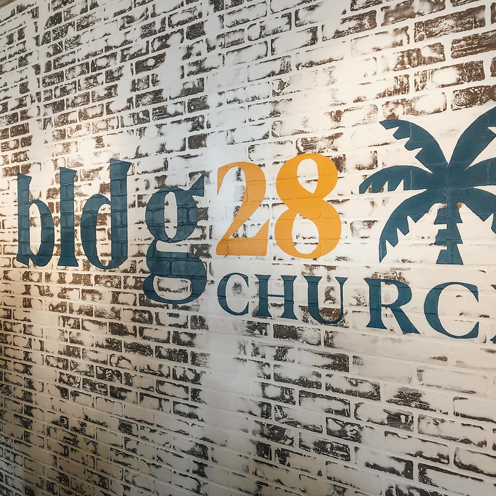
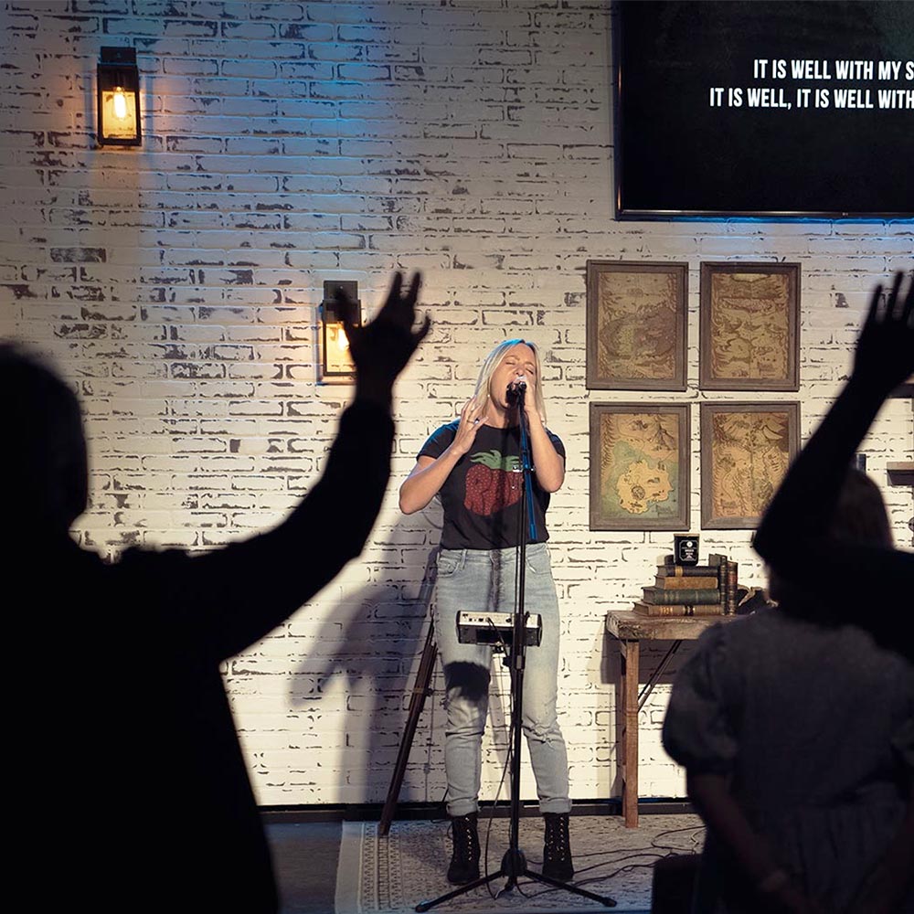
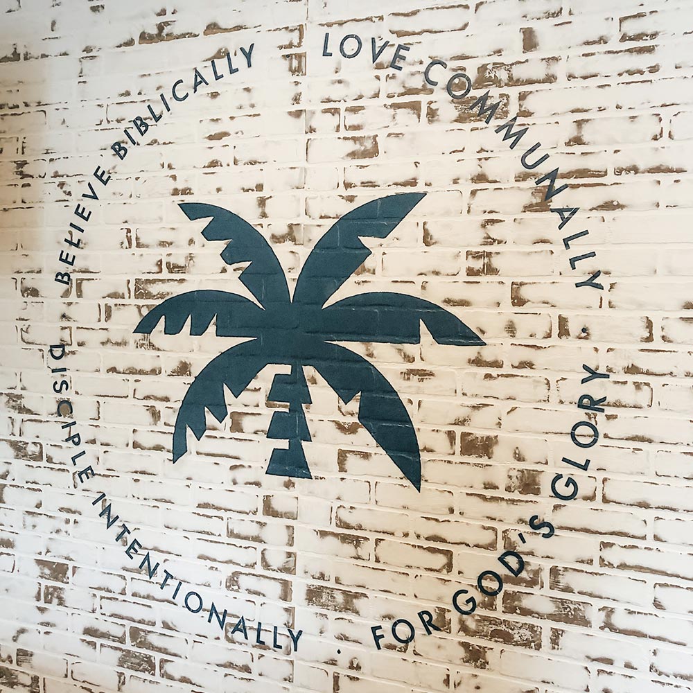
Not only was the brand identity a bit dated, the interior of the church, the signage, decor, print design and social media felt out of touch as well. I consulted with the church on ways to incorporate the new identity into the feel and vibe of the church. The results were new signage, wall graphics, print materials, and interior decor.
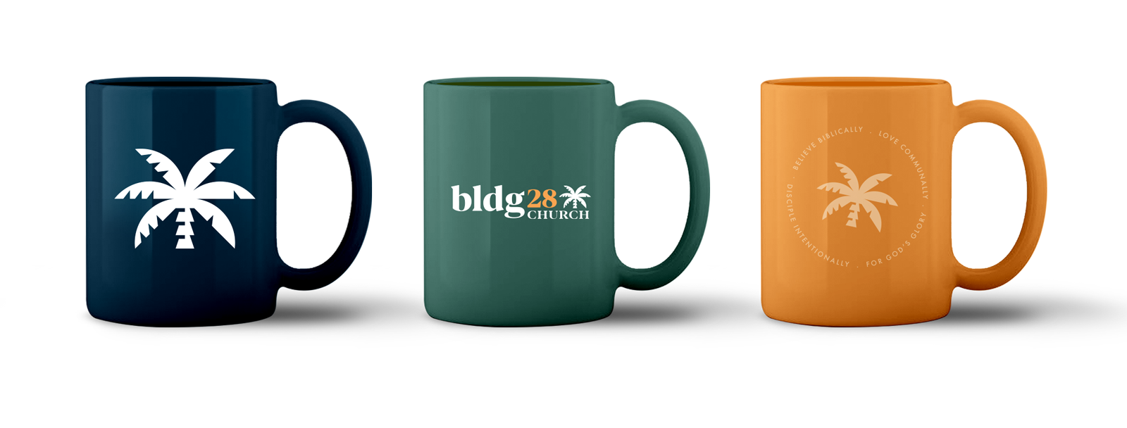
Apparel & Merchandise
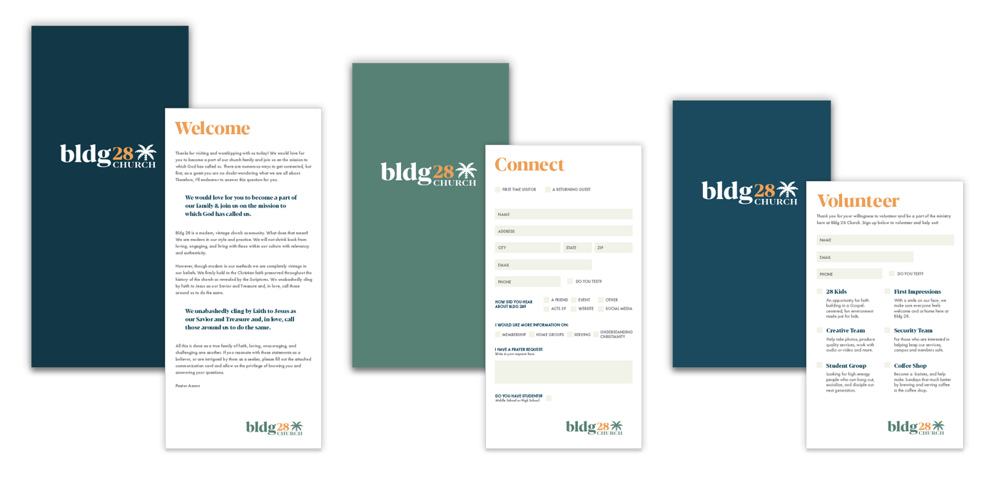
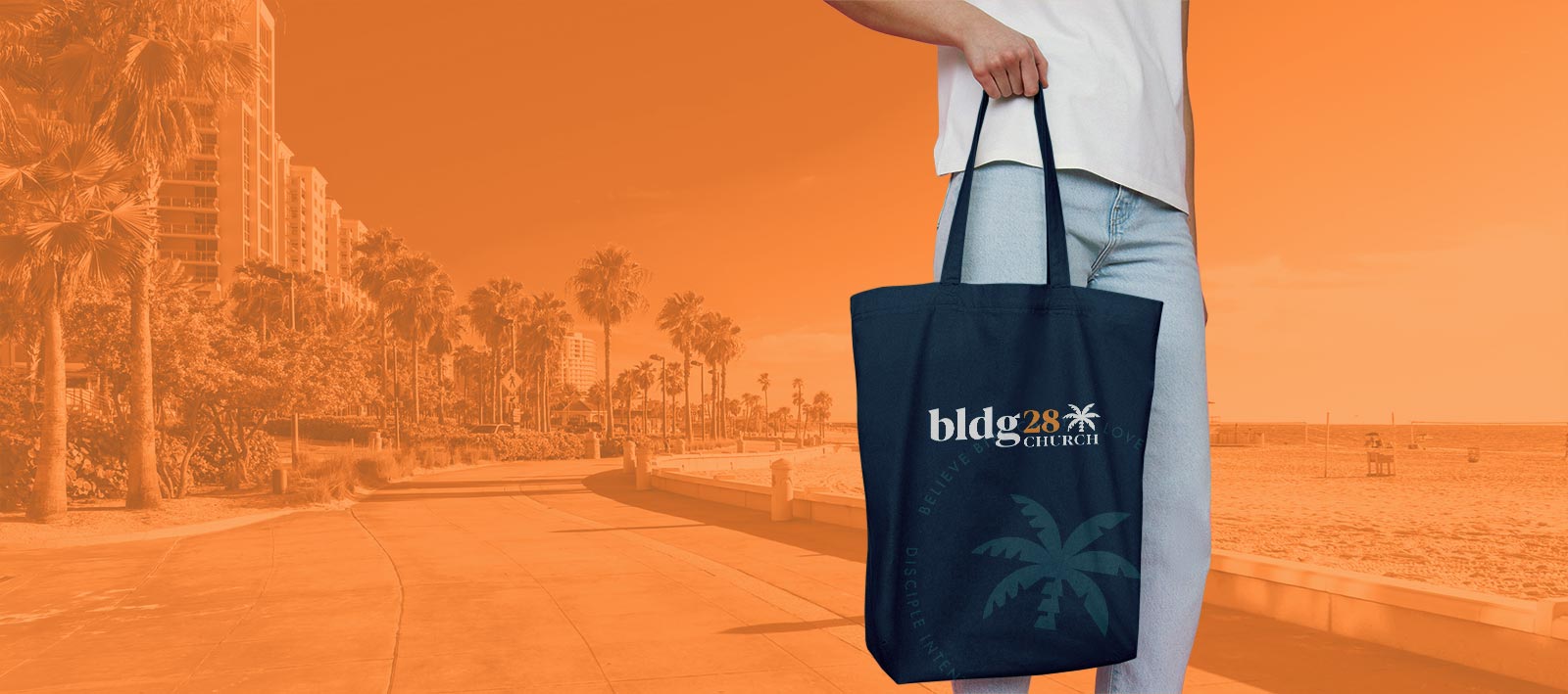
I worked with Bldg 28 to come up with a wide array of apparel, merchandise, and print media. This included everything from shirts and hoodies, mugs and totes to connection cards, flyers, and handouts.
Graphic & Print Design
With the rebranding, Bldg 28 needed fresh marketing materials, connection cards, and church resources. In addition to the branded print collateral, I also changed the direction of the sermon graphics, podcasts artwork, promotional materials, and more.
Bldg 28 Church continues to need new monthly materials for the website, social media, and church promotion, and our relationship has evolved more and more to meet these expanding demands.

