Ashes & Earth Candle Co
Combining a love for travel with the art of candlemaking.
A startup company focused on candle-making, travel, and the outdoors. What could be a cooler thing to work on? Ashes & Earth is a small startup introducing candles that have unique scents and are inspired by travel, destinations, experiences and adventures.
Jumping into this branding, design, packaging and website development project was not only super fun for me, but really drove me to expand my horizons in terms of both creativity and usability.
Primary Logo Mark
01
02
03
04
The Challenge
The challenge here is really the same challenge that every startup small business faces: in what direction do we go? The test for me was combining these keywords into a cohesive brand: outdoors, travel, candles, business, adventure, classic, outgoing, modern, sleek, and bold. I did my best, to build a brand that not only combined all of those feelings and emotions but showcased the best of each one.
What We Did
-
Brand Identity
-
Research & Strategy
-
Product Design
-
Web Design & Development
-
Graphic Design
Secondary Palette
01
02
03
04
05
06
Branding
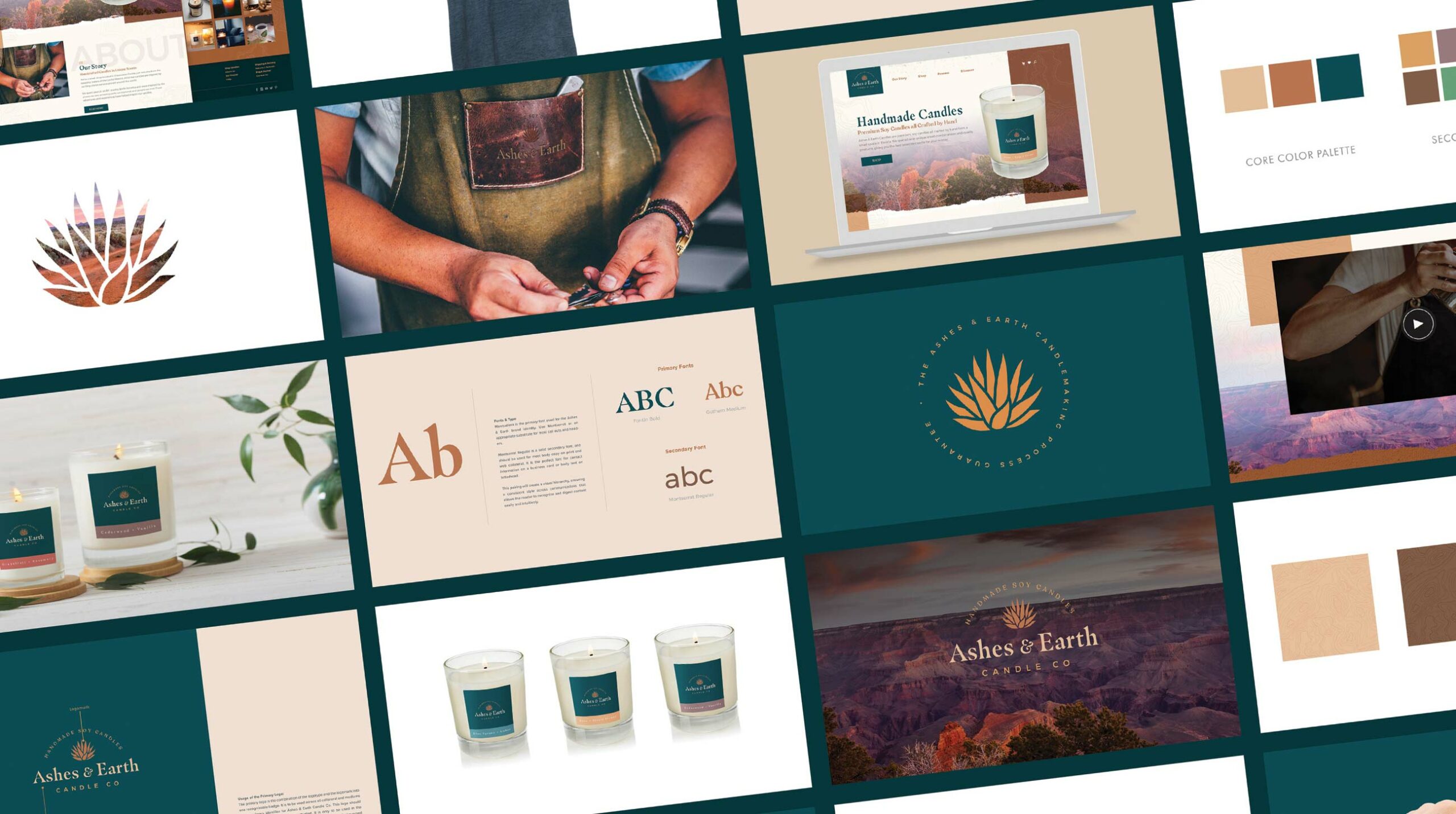
Beginning with a strong and diverse color palette was important to this brand. The core palette really conveys a vintage / western travel and outdoor feel, but I needed to build a secondary/supporting palette that could be used for the various product lines and features.
Expanding on the palette, I dove into a brand mark, drawing up a succulent / agave type plant icon that really represents both the outdoorsy / travel side of the business with an image that denotes growth, strength, sustainability, and nature.

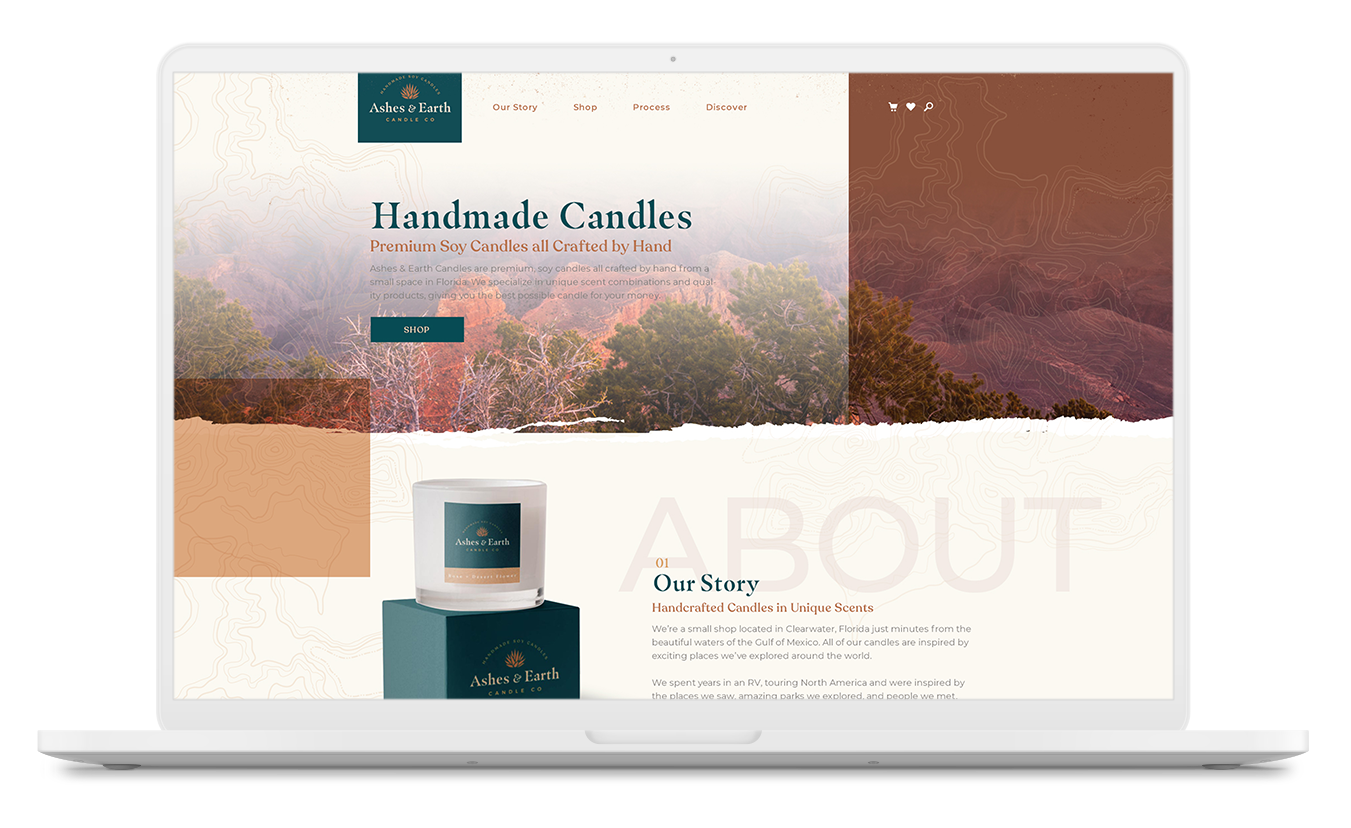
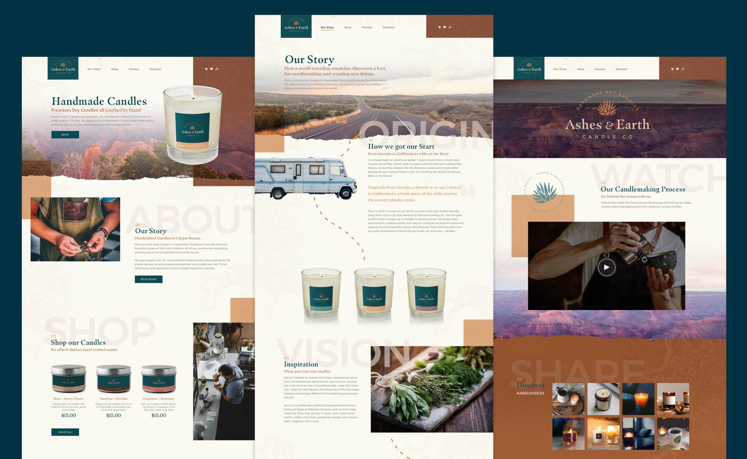
Website Presence

Mobile Development
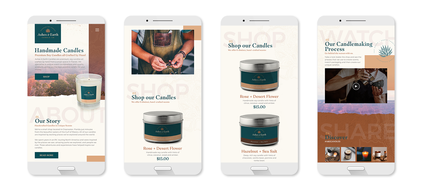
Trying to place a real emphasis on the mobile version of the website, I tackled this project with a mobile first website approach. I designed and laid out most of the pages from a mobile perspective first - then basing the desktop version of the site off of the mobile layout and user flow.
Print & Packaging
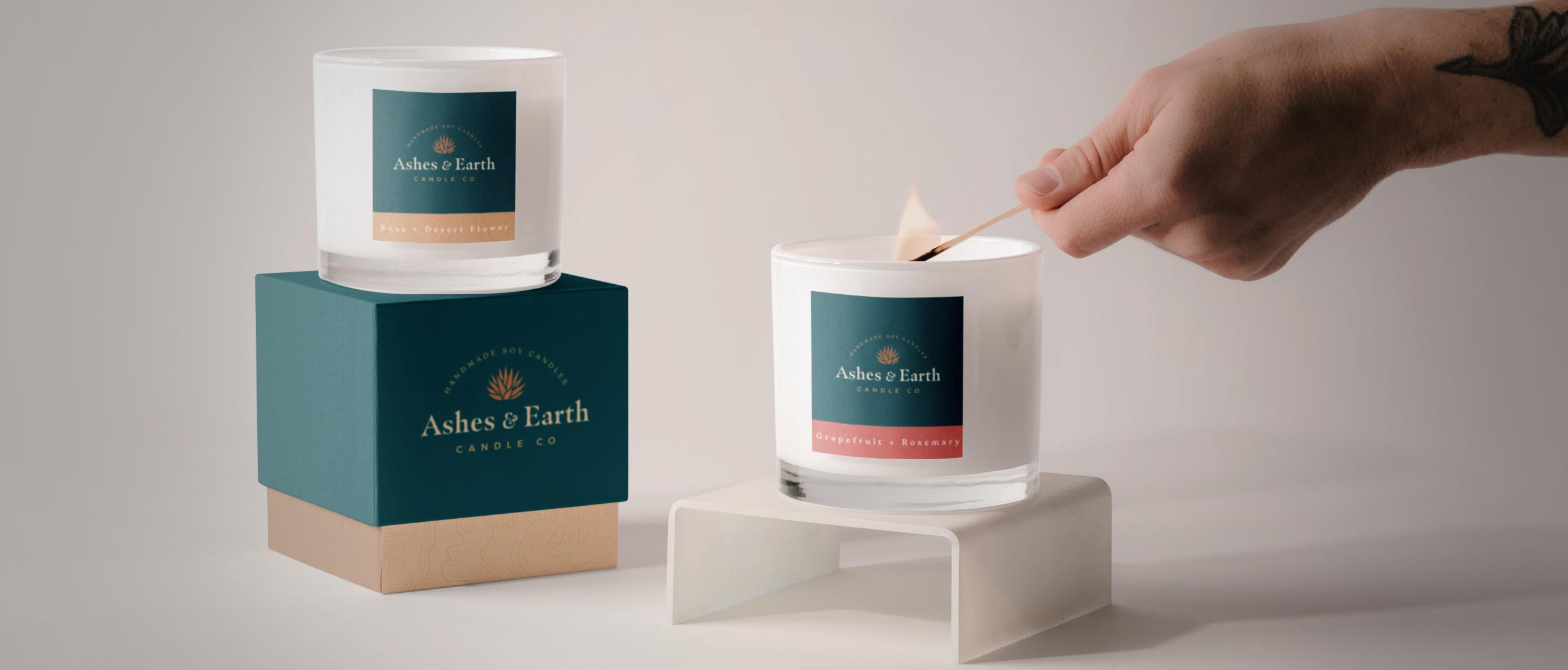
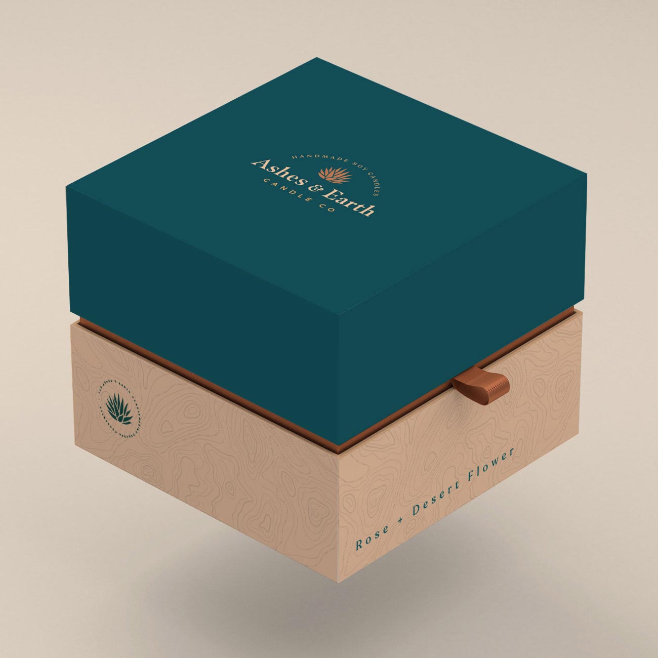
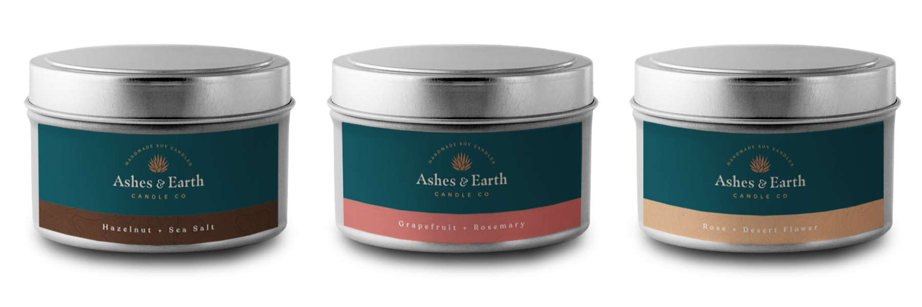
Launching with multiple product lines: various soy-based candles, Ashes & Earth needed cohesive packaging for each candle scent that truly promotes the brand, keeps a memorable and professional image, and yet creates some diversity within each candle concept. This is where the secondary palette came into play, engineering a color scheme and naming system for each of the candles that the company wanted to launch with.
