Carolina Petals
A simple and graceful brand for a South Carolina floral company.
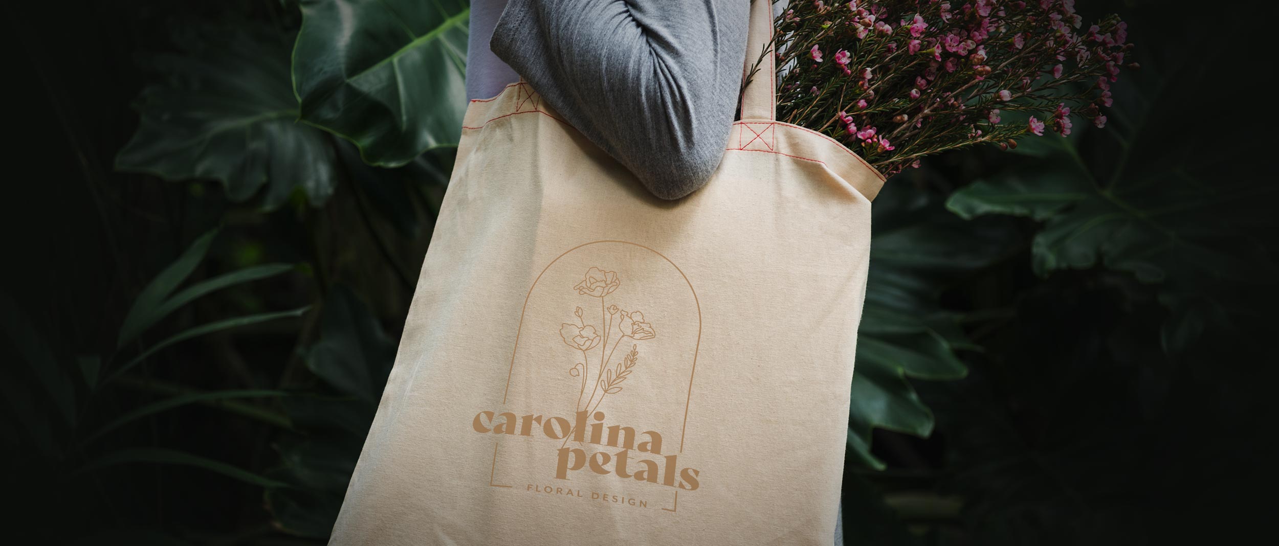
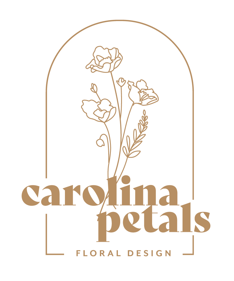
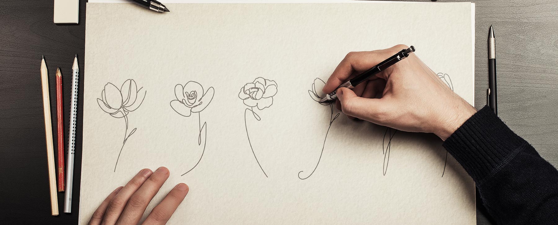
A small, startup floral design company came to me in need of a logo and brand image. We worked with them to come up with something versatile and timeless, that would work well across all platforms and cater to their South Carolina audience. The brand combines hand drawn sketches with a bold but elegant typeface to create a fun, cohesive and attractive style.
When Gracy was starting up her new floral design company, Carolina Petals, she approached me about working with her on a logo and some brand identity. Having been referred to me after seeing some of my previous work, she had a general idea of what she wanted, and I knew it would be a good place to start.
Primary Logo Mark
01
02
03
04
The Challenge
Gracy had some ideas, and ran them by me in the beginning... I knew the challenge was going to be marrying the ideas of a more modern, bold type face with some hand-drawn flowers all set within an emblem type setting. After a few iterations of going back forth on both typeface and flower sketches, we both were happy with the way that the project began taking shape.
"Nathan was awesome to work with! He was super quick to respond, listened to my vision, and delivered a better logo than I had pictured! He was very willing to make revisions and did them very quickly."
Gracy Calhoun
Owner
What We Did
-
Brand Identity
-
Illustration
-
Graphic Design
Unused Logo Comps

The Answer
We went back and forth on several different ideas, before landing on the final version of a bouquet of hand drawn flowers. The result has been a success for Gracy and Carolina Petals, helping grow the business throughout lower South Carolina and beyond.
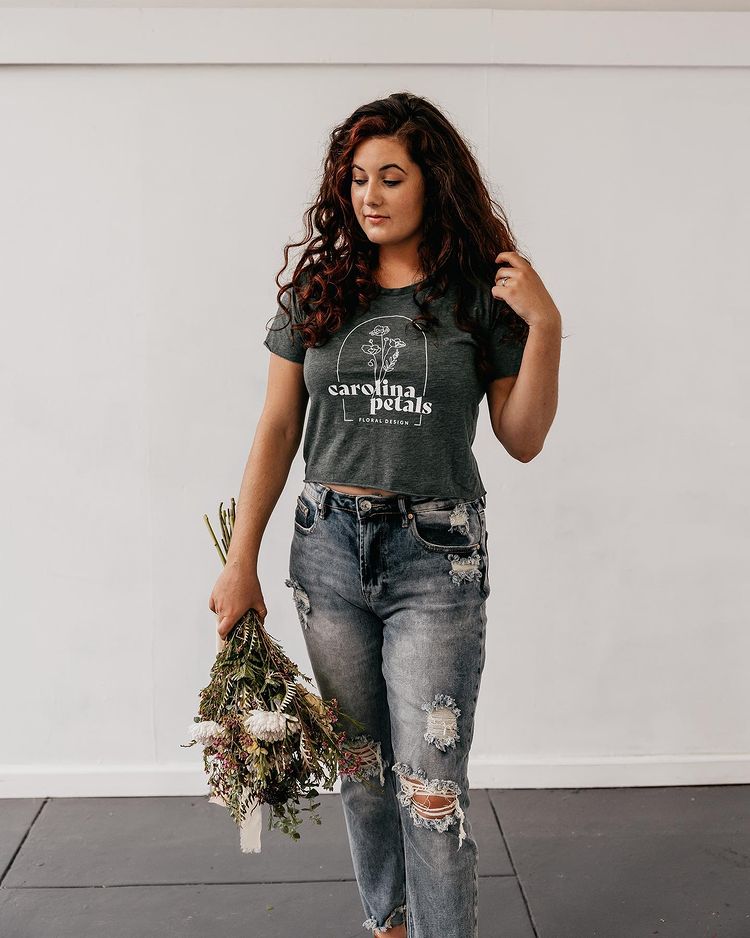
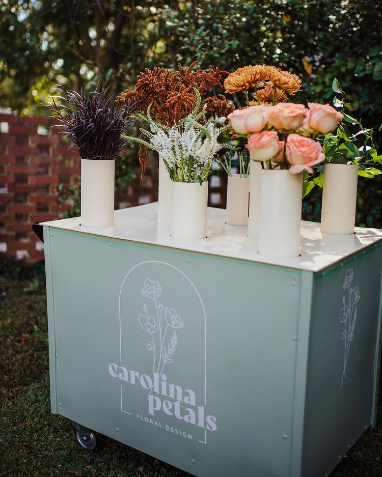
In addition to the brand identity, I helped with a series of business cards and marketing collateral. The business continues to thrive, and integrate the logo into shirts, carts, and other marketing elements and materials.
