Anderton Apparel
A culture and identity for a start-up outdoor apparel company.
Anderton Outdoor Apparel came to me as a startup company specializing in outdoor clothing, camping/hiking gear, and travel apparel. They not only entrusted me with their online branding and digital marketing but in completely building their identity and company culture from the ground up.
Currently engaged in building their website into an interactive showcase and e-commerce marketplace as well as all types of print and marketing materials, this has been a super exciting project to work on from day one.
Primary Logo Mark
01
02
03
04
The Challenge
Occasionally working with a start-up company can be challenging – especially if they have no sense of direction or too much sense of direction, as in: they attempt to control every detail of the branding and design. What I love is the ability to work with a young company that has great ideas and creative passion yet allows me to build their brand and compose their image by trusting me with the details. And working with Anderton Apparel was one of those cases.
Anderton’s challenge was that they had nothing but a name and some clothing to start with. No logo, no brand image, no print or packaging or website. I was able to work with them to compose an entire brand and design campaign along with various technological and print components.
“Nathan truly met and exceeded every single expectation that we had. I cannot express adequately how thrilled we are with he and his work.”
Scott Maltis
Marketing Director
What We Did
-
Brand Identity
-
Research & Strategy
-
Web Design & Development
-
Print & Packaging
-
Graphic Design
Branding
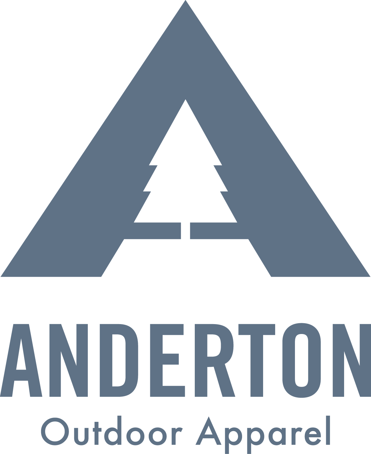
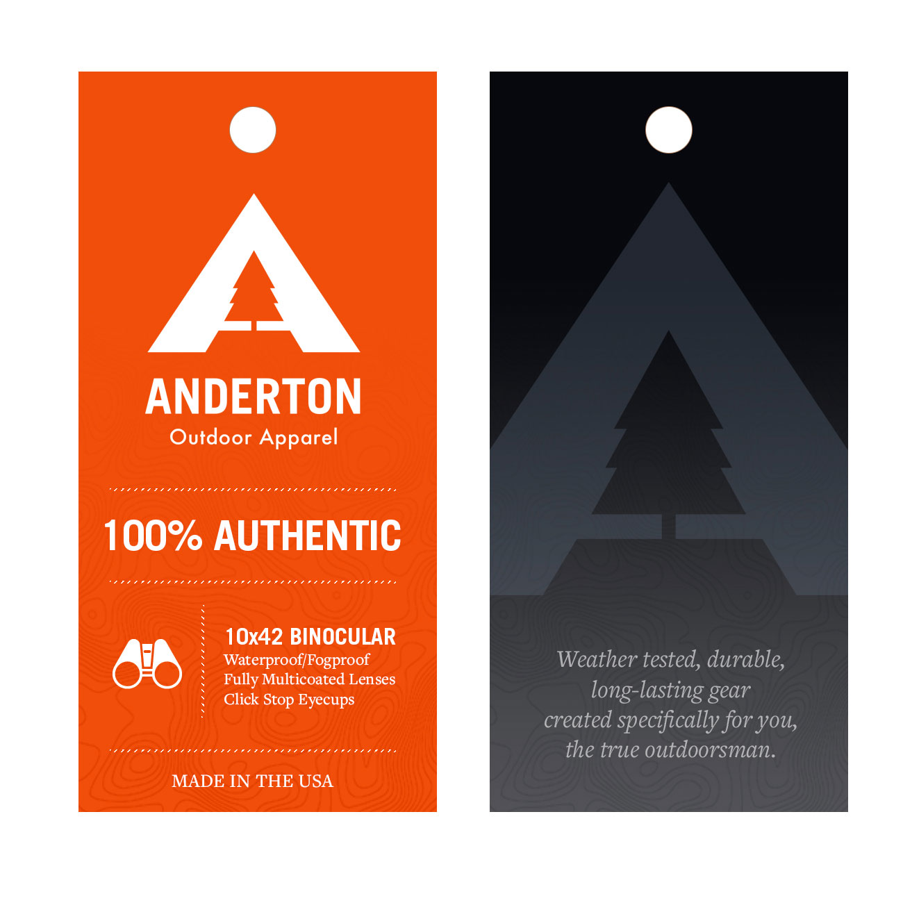
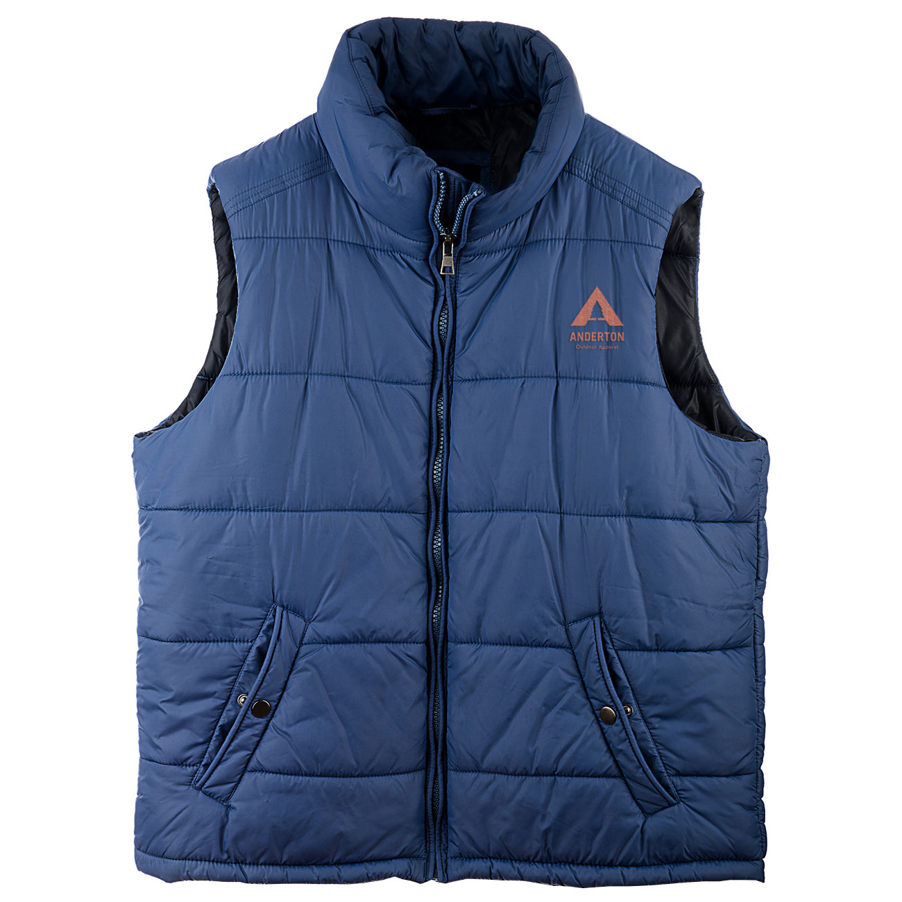
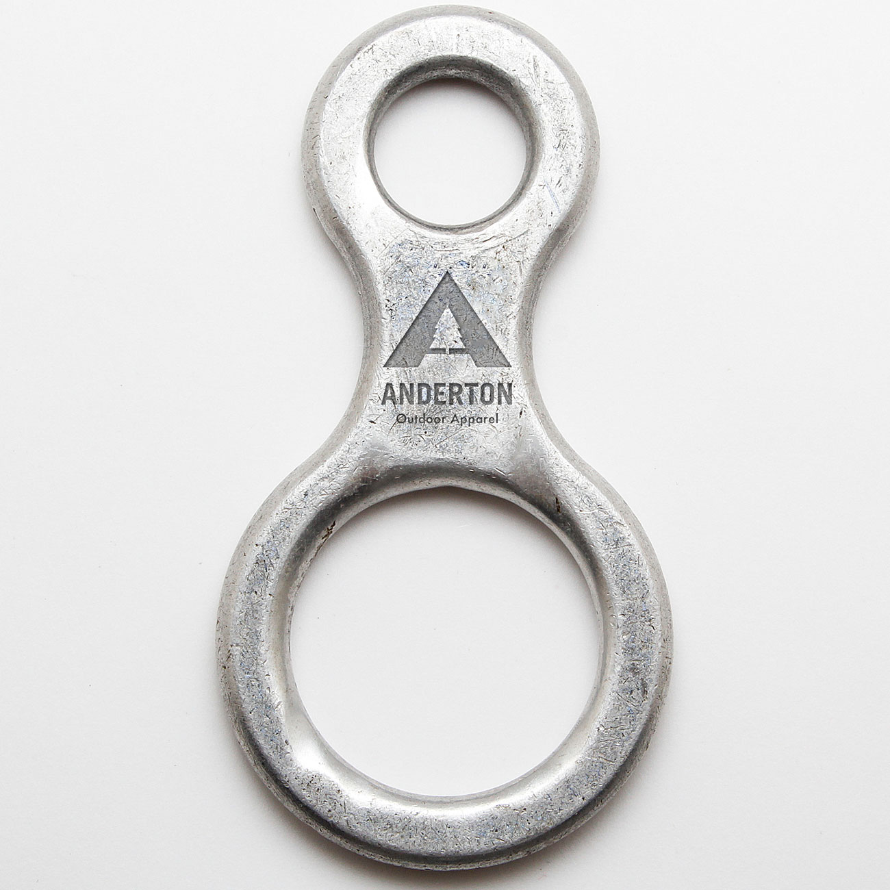
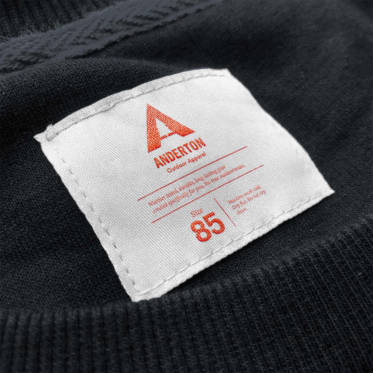
Though I explored several logo directions, the capital letter “A” kept coming back to me and I was able to create a series of marks and icons that used their company initial with elements of the outdoors. Eventually we settled on the combination of the A and a coniferous tree and used that image to build product packaging, labels, and various marketing materials.
Product Packaging
Keeping consistent with the brand I created we wanted to expand on the packaging adding in elements of angled lines and topographical maps to give it a sleek, modern look yet stay with the outdoorsy element.
I also used the packaging to help drive the overall brand colors, using a red/orange and deep blue/slate palette that I would carry throughout the website and digital marketing as well.
Website Presence
Website Design & Development
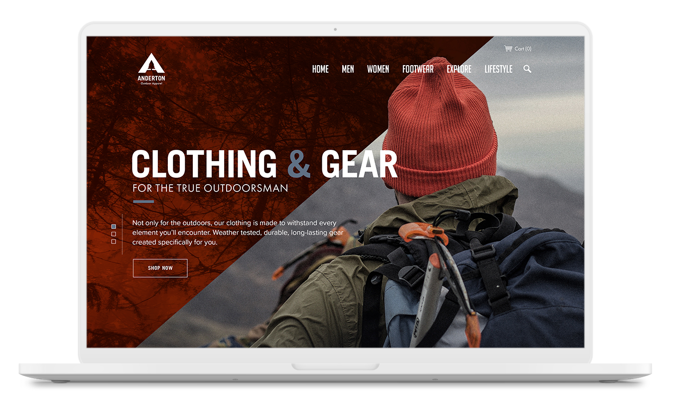
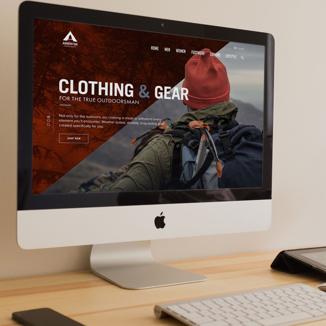
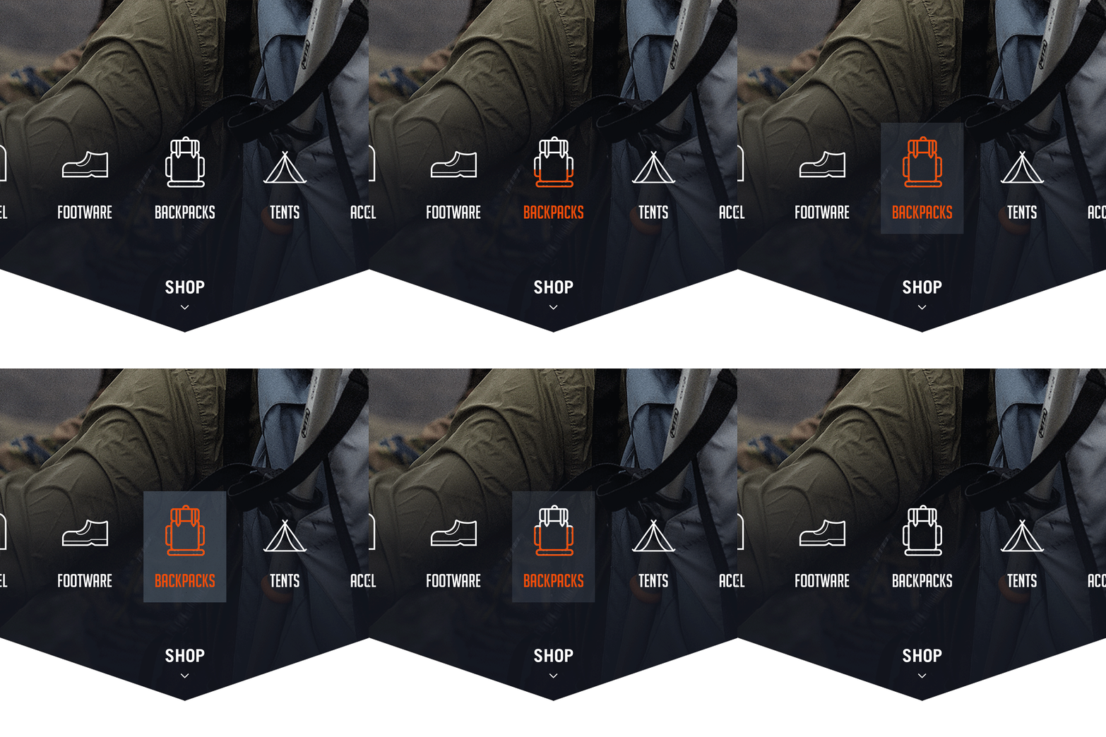
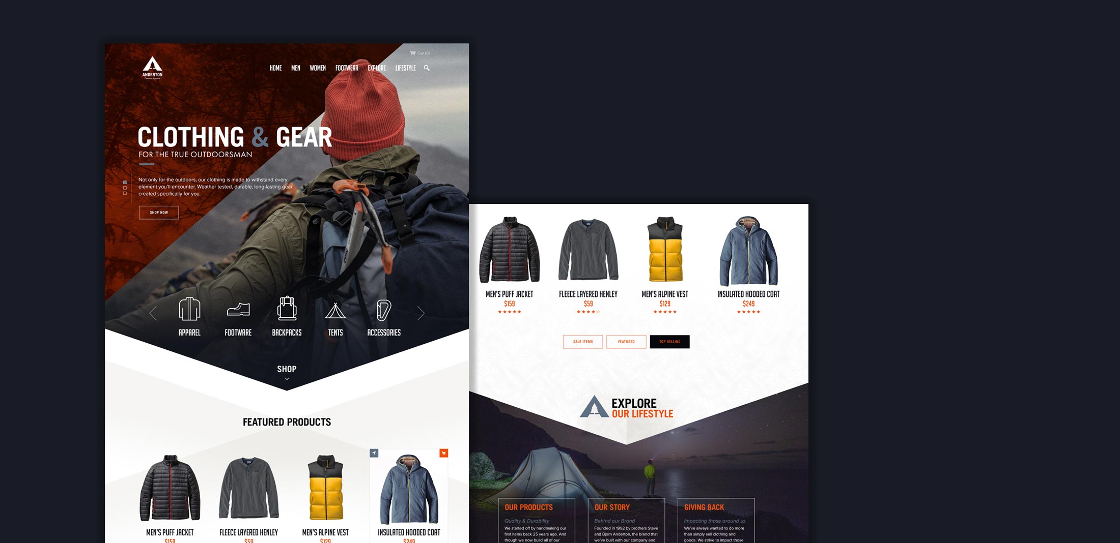
The Anderton website presents a unique challenge. Their team wanted both an innovative interface with an artistic approach to their online brand yet needed to keep the online store and experience very clean and modernized. So, working through the ins and outs of both of those challenges presented some obstacles, but in the end the client was very pleased with the overall creative tone and the usability and flow of the online store both on the desktop and mobile versions of the website.
